Dashboards (on the Dashboards Page)
The Dashboards page is used to generate and view various types of dashboards within a specified date range, where each type of dashboard displays various measures of user productivity (or other information) by using the data recorded by Syteca while monitoring user activity on the endpoint Client computers.
These user productivity dashboards (along with other dashboards concerned with monitoring and threat detection) are displayed in the form of convenient, interactive and individually-customizable charts and tables, enabling the user to drill down (with many similar to the BI (business intelligence) chart report templates produced when importing data from Syteca into Power BI report templates by using the Syteca API Data Connector).
NOTE: A Management Tool user needs to have the administrative Viewing Monitoring Results permission to access the Dashboards page, and only information on the Clients that the user has the Viewing Monitoring Results permission for Clients for is displayed in the dashboards.
NOTE: For best performance of the dashboards, if used, the PostgreSQL database needs to be updated to version 13 or higher.
Table of Contents
1. Customizing All the Dashboards
To customize the global filter settings (i.e. in all the dashboards on the page simultaneously), do the following:
1. Click the Dashboards navigation link (on the left).
2. On the Dashboards page that opens, click the global Filter Settings (
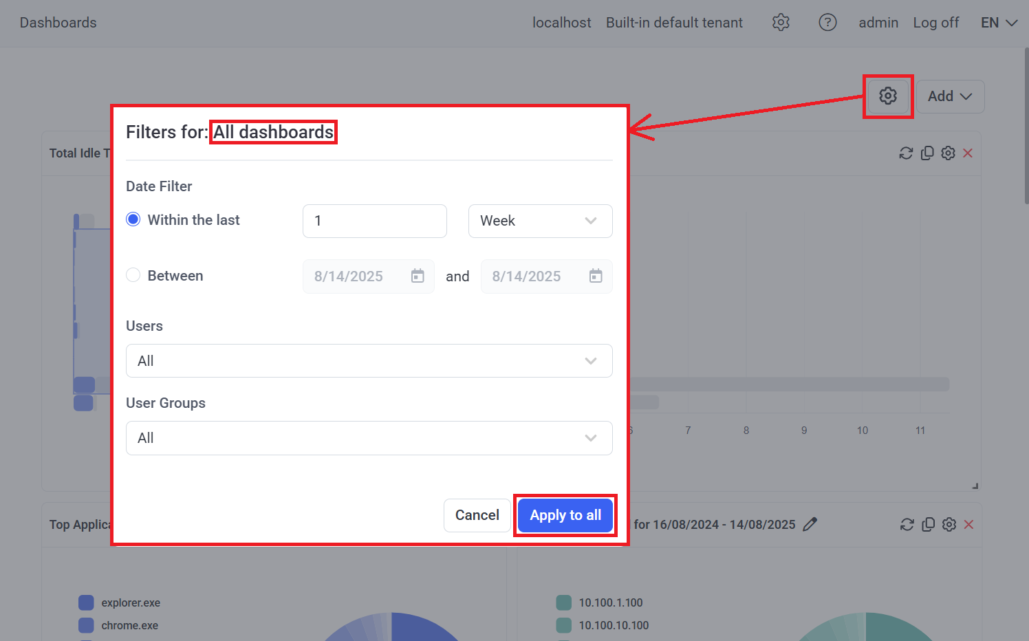
3. In the pop-up window that opens, in the Date Filter section, select either the Within the last or Between radio button, and then select the required global date range (i.e. the date range for all the dashboards on the page), as well as the Users and User Groups required, and then click the Apply to All button.
4. The new filter settings are then applied to all the dashboards on the page.
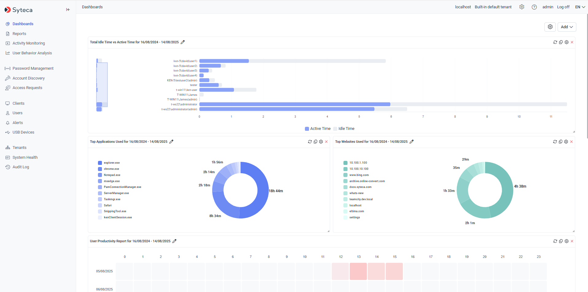
NOTE: When using large amounts of (or no) session data, it may take up to 2 minutes (i.e. when using the default timeout value) to generate the data in the dashboards (please also refer to section 4. Troubleshooting Issues below).
5. Then click the Filter Settings (
2. Adding and Customizing Individual Dashboards and the Page Layout
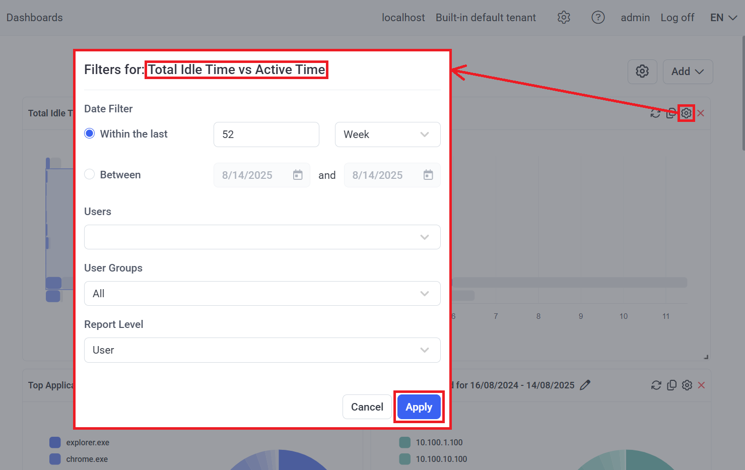
To customize the filter settings in any individual dashboard so as to modify the range of data specified in it, click the Filter Settings (
• Date Filter: To modify the date range as required (either within or outside of the values specified in the global filter settings).
• Users: To search for and select only specific users to be included (i.e. to be displayed as separate bars in the bar chart).
NOTE: If "Group" is selected in the "Report Level" drop-down list below, all the user groups that the selected users are in will be included as separate bars in the bar chart.
• User Groups: To search for and select only specific user groups to be included (i.e. to be displayed as separate bars in the bar chart).
NOTE: If "User" is selected in the "Report Level" drop-down list below, all the users in the selected user groups will be included as separate bars in the bar chart.
• Report Level [only available for the "Total Idle Time vs Active Time" dashboard type]: To select either User or Group so as to specify which of these will be represented by each bar displayed in the bar chart.
NOTE: The filter settings in individual dashboards are independent of the global filter settings (i.e. of the filter settings for all dashboards simultaneously), and can therefore be modified to be either within (i.e. a subset of) or outside of (i.e. a wider range than in) the values specified in the global filter settings.
To rename a dashboard, click the Edit (
To resize a dashboard, drag & drop the bottom right corner of the dashboard as required.
To rearrange the layout of the dashboards on the page, drag & drop the dashboard header to the location required.
To hide a dashboard (i.e. remove it from the page), click the Remove (
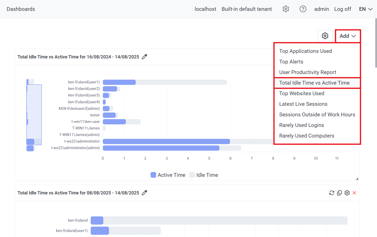
To add any dashboard to the page (where a maximum of 18 dashboards can be added and displayed on the page at the same time, including multiple dashboards of the same type, and then customized in the filter settings of each dashboard individually), either:
• Click the Add button (in the top right of the page), and then select the type of dashboard to be added.
• Click the Copy (
3. Types of Dashboards
One of each of the 9 different types of user productivity (and other) dashboards described below are displayed on the page by default.
3.1. Total Idle Time vs Active Time: A bar chart showing an overview of the Total Active Time to the Total Idle Time ratio for each user (or for all the users in each user group) selected, i.e. an overview of how much time each user (or all the users in each user group) selected actively interacted with their computers versus how much time each user (or all the users in each user group) selected has (have) been idle, in all of their sessions in the date range selected.
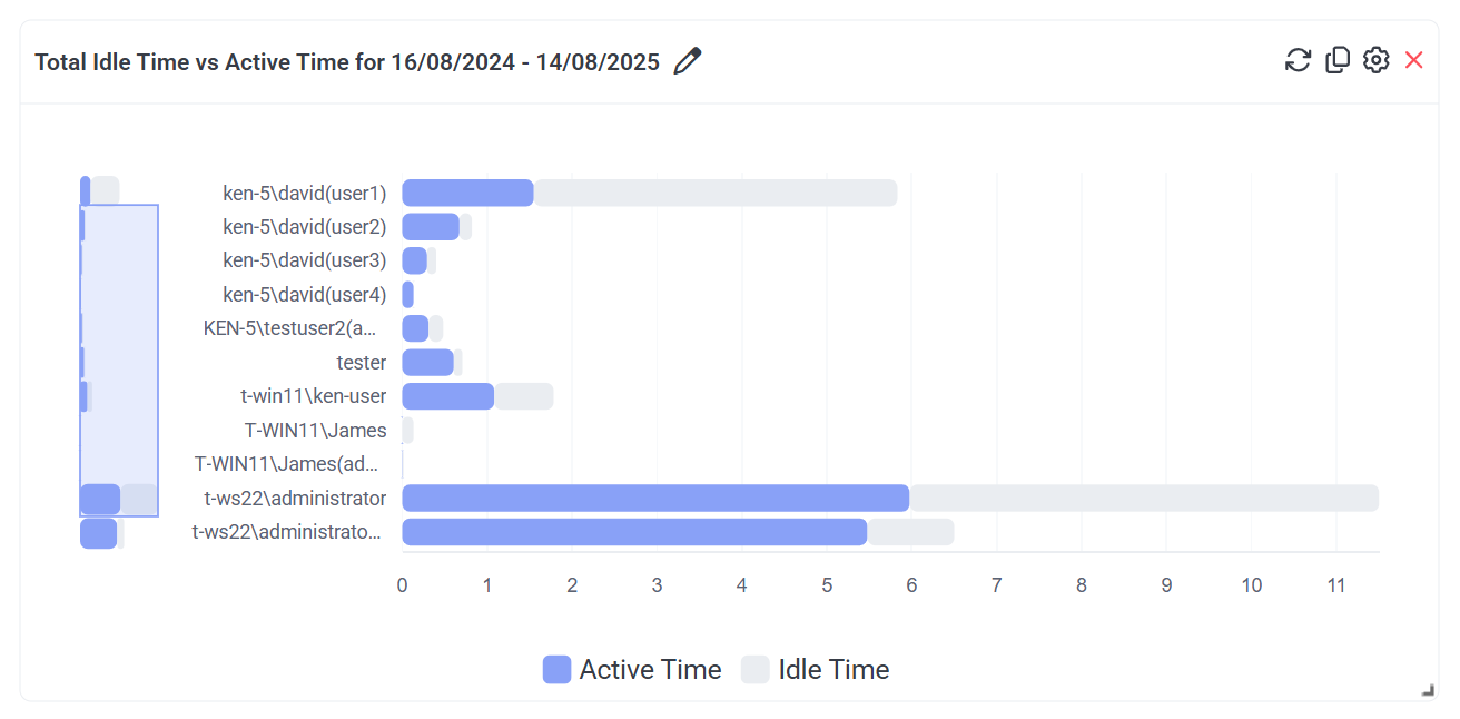
NOTE: The "Total Active Time" for a session is calculated as the "Total Session Time" minus the "Total Idle Time".
NOTE: The recording of idle events is not currently implemented for SSH sessions on Linux Client computers.
NOTE: Data with less than 1 minute of user activity is not included.
A maximum of the first 10 bars are displayed, where if there are more than 10, a vertical slider is also displayed (on the duplicated mini-bar chart on the left of the main bar chart) which can be used to navigate to display the other bars by dragging & dropping the slider down (and back up again).
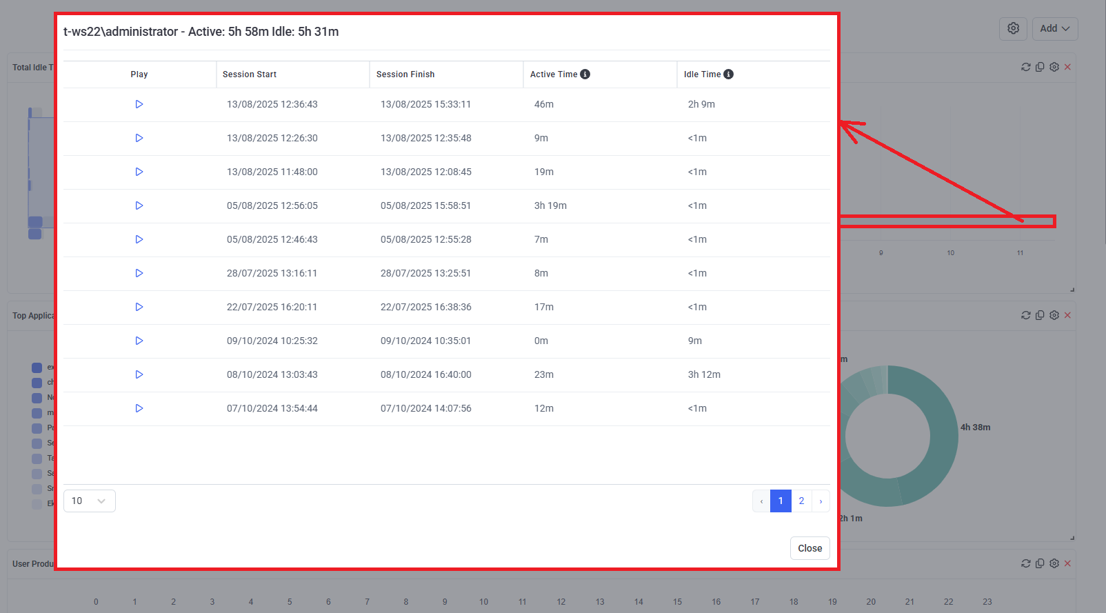
To view detailed information about all the sessions for any user / user group displayed in the bar chart, click on the required bar to open a pop-up window (where the Play (
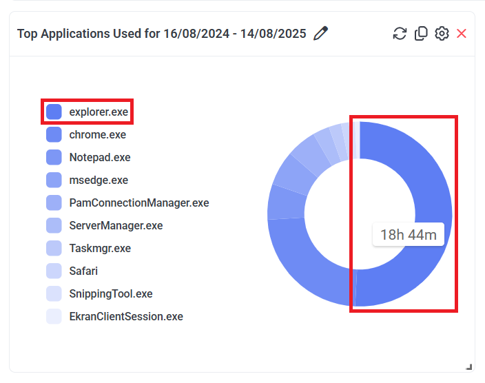
3.2. Top Applications Used: A pie chart showing the top 10 applications with the longest total time used by all the users (and/or by all the users in the user groups) selected, in all of their sessions in the date range selected.
NOTE: Data with less than 1 minute of user activity is not included.
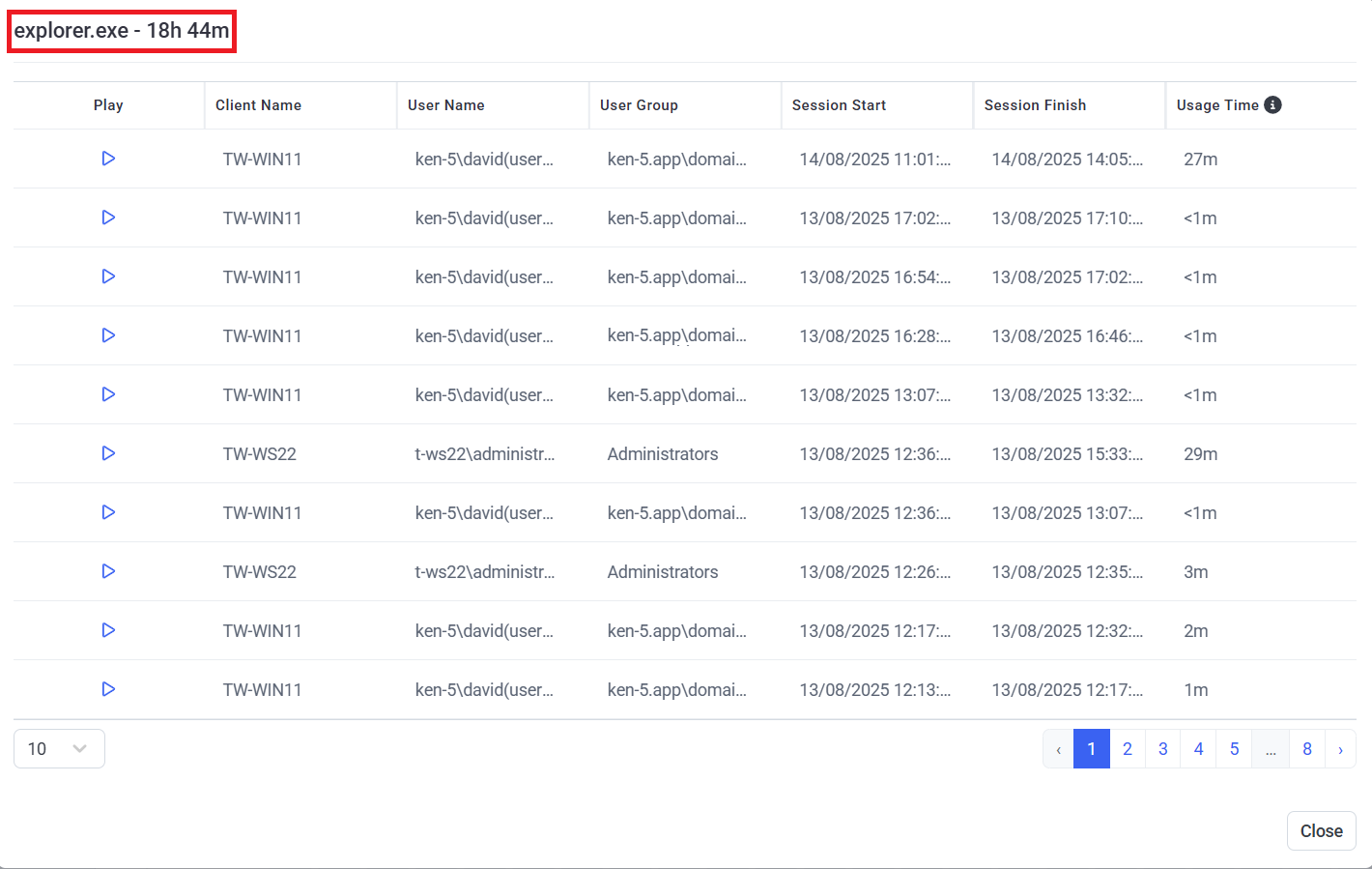
To view detailed information about all the sessions for any application displayed in the pie chart, click on the required chart segment or application name (see the screenshot above) to open a pop-up window (where the Play (
The following settings can be configured for this dashboard, by clicking the Filter Settings (
• Date Filter
• Users
• User Groups
3.3. Top Websites Used: A pie chart showing the top 10 websites with the longest total time spent visiting them by all the users (and/or by all the users in the user groups) selected, in all of their sessions in the date range selected.
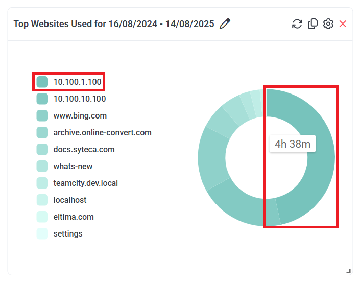
NOTE: All webpages viewed with lower-level domain names (i.e. after the first "/" character) are included in the top-level domain names shown in the chart.
NOTE: URL monitoring is only currently implemented for Windows and macOS Clients (i.e. not for Linux Clients).
NOTE: Data with less than 1 minute of user activity is not included.
To view detailed information about all the sessions for any website displayed in the pie chart, click on the required chart segment or website name (see the screenshot above) to open a pop-up window (where the Play (
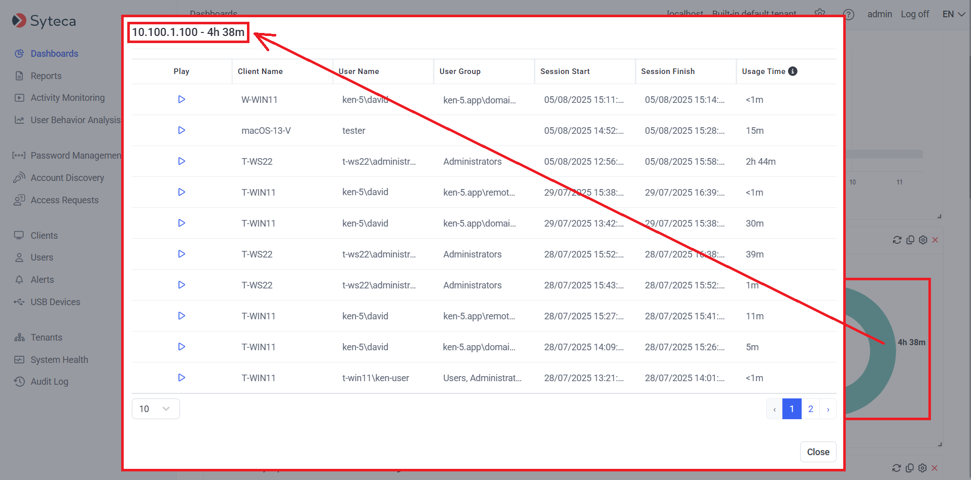
The following settings can be configured for this dashboard, by clicking the Filter Settings (
• Date Filter
• Users
• User Groups
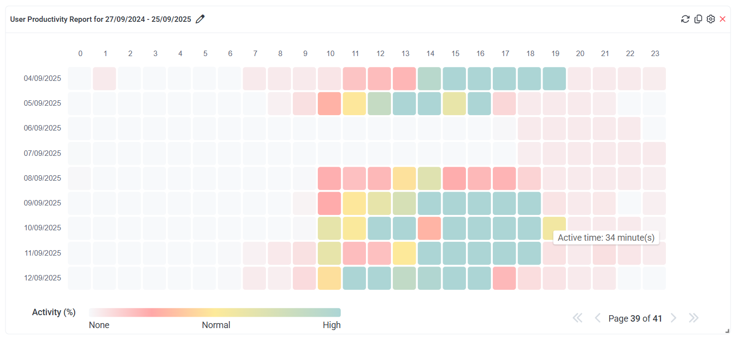
3.4. User Productivity Report: A heatmap chart showing which hours of the day users were on average at their most productive i.e. showing the Average Active Time in minutes for each hour of each day for all the users (and/or for all the users in the user groups) selected, in all of their sessions in the date range selected, where:
• Each row represents a day in the date range selected (with the first day shown in the top row).
• In each row, each of the 24 cells represent an hour in the day (with the first hour starting at midnight shown in the "0" column), where each cell is color-coded based on the number of active minutes in the hour (see the Activity (%) key displayed below the chart).
Example calculation: An example of the calculation of Average Active Time is as follows: The dashboard is filtered to show the activity of users Ann Atkins, Ben Bull, and Cathy Cole. From 9:00am until 10:00am, the Total Active Time of Ann Atkins is 10 minutes, of Ben Bull is 15 minutes, and of Cathy Cole is 35 minutes. Therefore, the Average Active Time for this hour for all three users is (10 + 15 + 35) / 3 = 20 minutes.
NOTE: The "Total Active Time" for one user for one hour is calculated as one hour minus the "Total Idle Time".
NOTE: The recording of idle events is not currently implemented for SSH sessions on Linux Client computers.
To view the Average Active Time for any hour, hover over any cell to display a hint.
To view the data for all the days in the date range, navigate between multiple pages by clicking on the First Page, Previous Page, Next Page, Last Page (
The following settings can be configured for this dashboard, by clicking the Filter Settings (
• Date Filter
• Users
• User Groups
3.5. Top Alerts: A bar chart showing information on (up to) the 20 most triggered alerts within the specified date range, ordered by the frequency of the different alerts triggered (with the most-frequently triggered alert at the top).
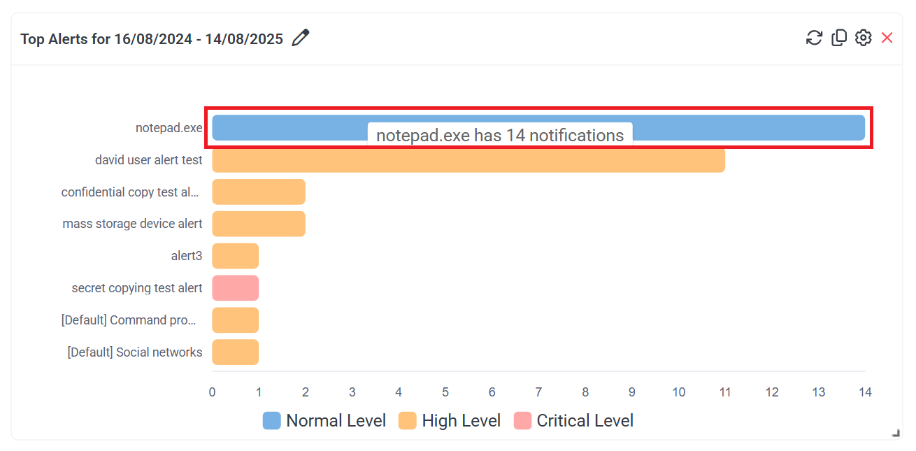
Each bar in the chart corresponds to an enabled alert (that was triggered at least once within the specified date range).
The length of each bar indicates the number of notifications received (i.e. the number of alert events that occurred) due to the corresponding alert being triggered, within the specified date range. Any bar can also be hovered over to see the number of times the corresponding alert was triggered (displayed in a hint).
The color of each bar corresponds to the alert risk level (as displayed in the key below the chart).
A maximum of the first 10 bars are displayed, where if there are more than 10, a vertical slider is also displayed (on the duplicated mini-bar chart on the left of the main bar chart) which can be used to navigate to display the other bars by dragging & dropping the slider down (and back up again).
To view detailed information on the alert events, click the required bar, and the following information is displayed in the pop-up window that opens:
• Play: Click the 
• Start Date: The date & time when the alert was triggered.
• Client Name: The name of the Client computer (on which the alert was triggered).
• User Name: The user name of the user logged in to the Client computer (who triggered the alert).
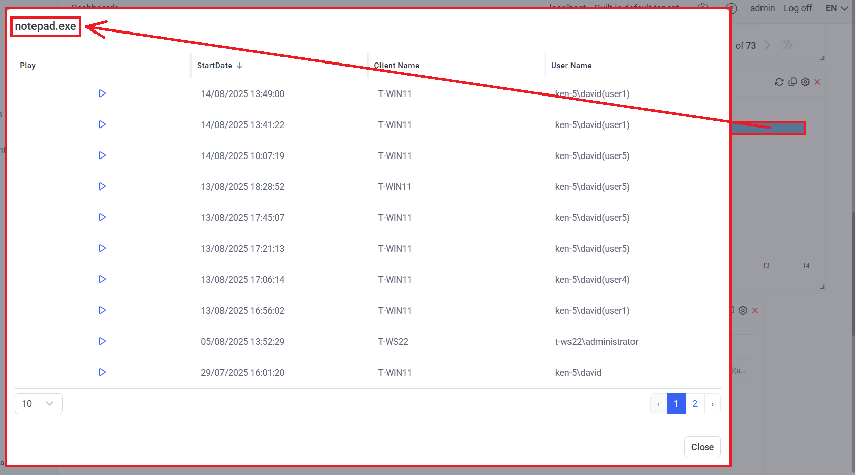
The following settings can be configured for this dashboard, by clicking the Filter Settings (
• Date Filter
• Users
• User Groups
3.6. Latest Live Sessions: A grid showing a list of the (most-recently started) sessions that are currently live (where the list can be sorted by clicking the column headers).
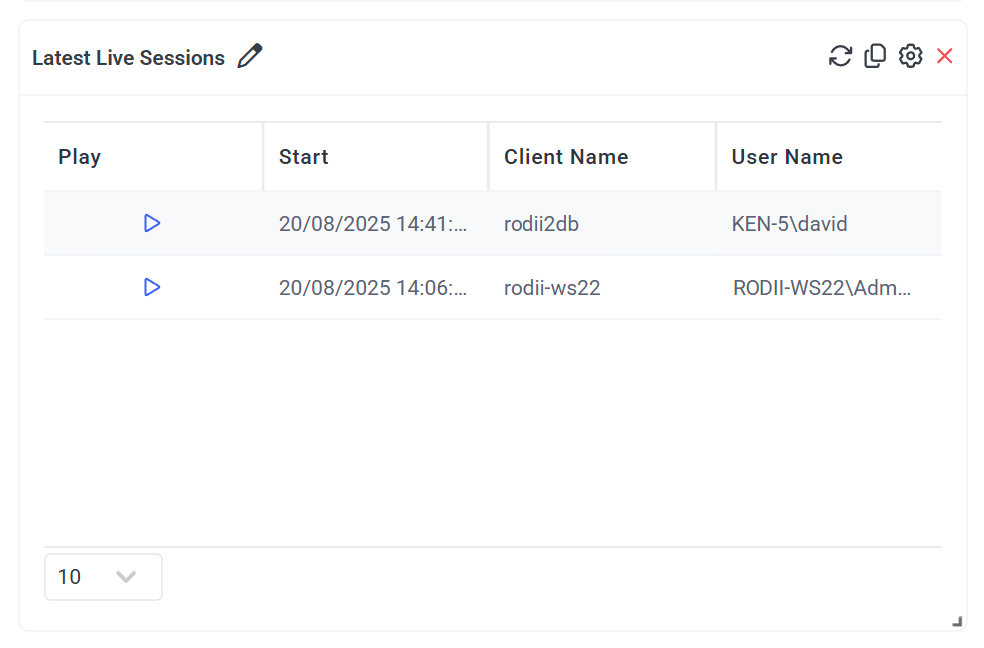
The grid contains the following columns:
• Play: Click the 
• Start: The date & time when the session started.
• Client Name
• User Name
The following settings can be configured for this dashboard, by clicking the Filter Settings (
• Users
• User Groups
• Number of Sessions: The maximum number of (most-recently started) sessions that are currently live to be included (i.e. displayed) in the list on the dashboard.
3.7. Sessions Outside of Work Hours: A bar chart showing information on computers used (i.e. sessions) during non-work hours and non-work days in the specified date range, ordered by date (with the most-recent date at the bottom).
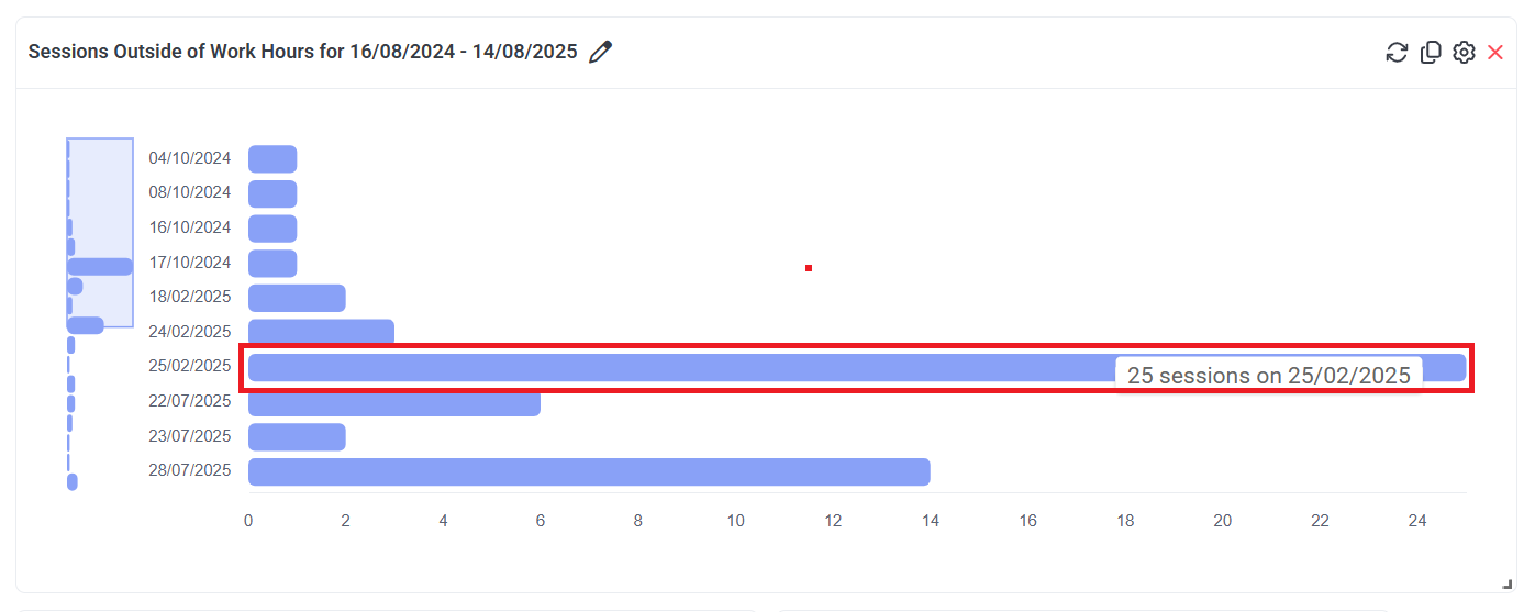
Each bar in the chart corresponds to a day with sessions (i.e. computers used) outside of standard work hours.
The length of a bar indicates the number of such sessions recorded on that date. Any bar can also be hovered over to see the number of sessions recorded on a specific date.
A maximum of the first 10 bars are displayed, where if there are more than 10, a vertical slider is also displayed (on the duplicated mini-bar chart on the left of the main bar chart) which can be used to navigate to display the other bars by dragging & dropping the slider down (and back up again).
To view detailed information on the sessions, click the required bar, and the following information is displayed in the pop-up window that opens:
• Play: Click the 
• Client Name
• User Name
• Start
• Last Activity
• Finish
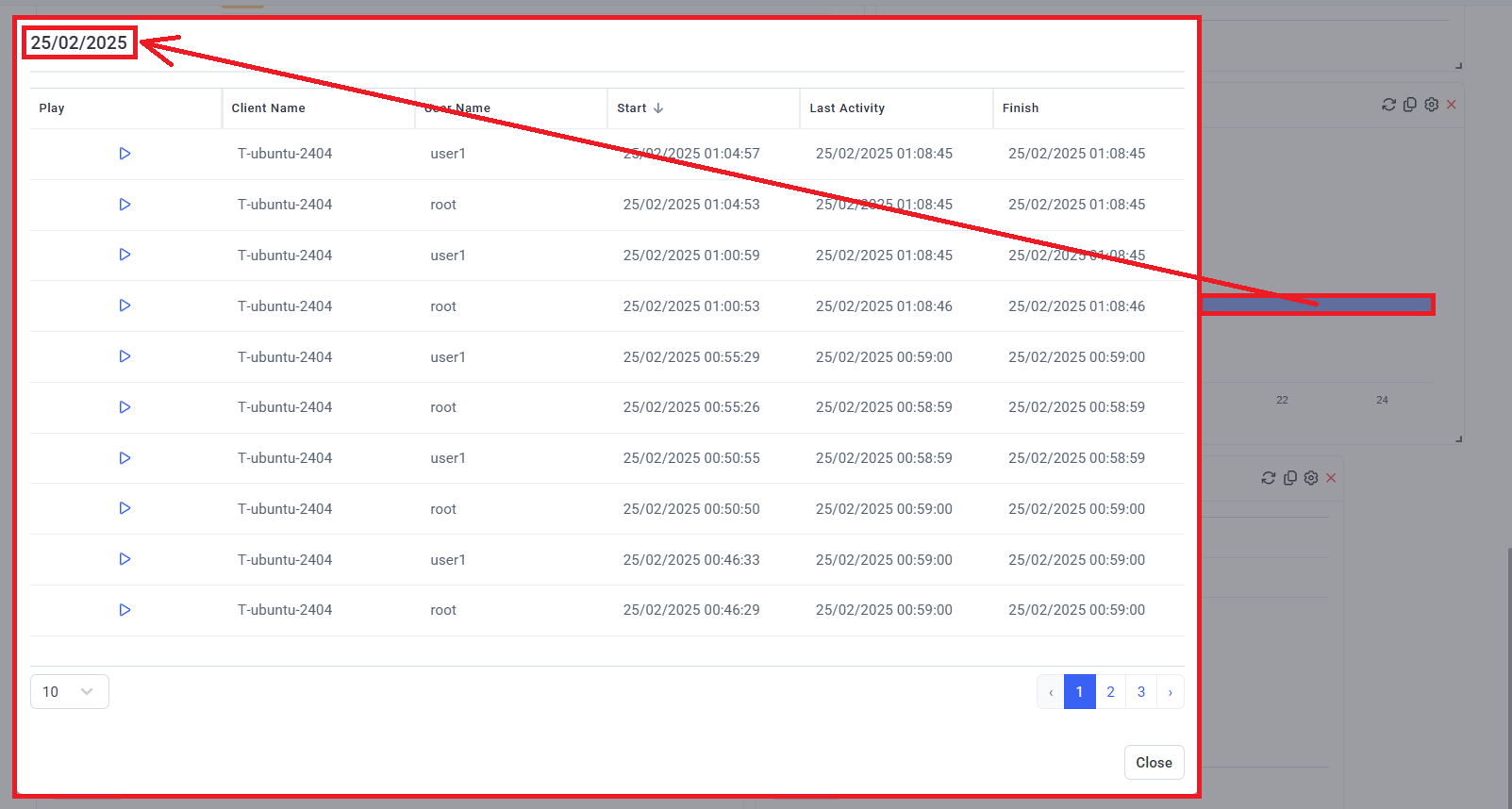
The following settings can be configured for this dashboard, by clicking the Filter Settings (
• Date Filter
• Work Hours: Select the hours of the week to be considered as included in the standard (i.e. “normal”) work schedule.
• Work Days: Select the days of the week to be considered as included in the standard (i.e. “normal”) work schedule.
• Users
• User Groups
NOTE: Only sessions containing user activity outside of the specified standard work schedule are displayed on the dashboard.
3.8. Rarely Used Logins: A grid showing information on users that have the fewest logins within the specified date range (where the list can be sorted by clicking the column headers).
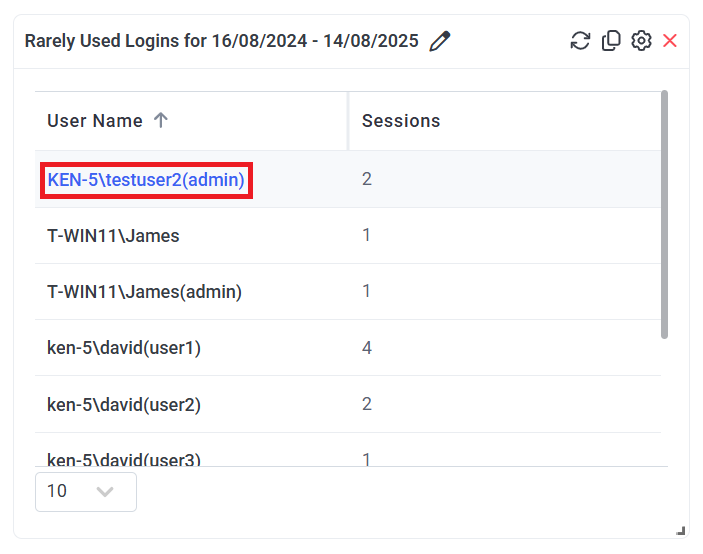
The grid contains the following columns:
• User Name
NOTE: If secondary user authentication is enabled, the secondary user name is also shown in brackets in the format: <Logged_in_Windows_user> (<secondary_authentication_user>).
• Sessions
To view detailed information on the sessions, click the required User Name, and the following information is displayed in the pop-up window that opens:
• Play: Click the 
• Client Name
• Start
• Last Activity
• Finish
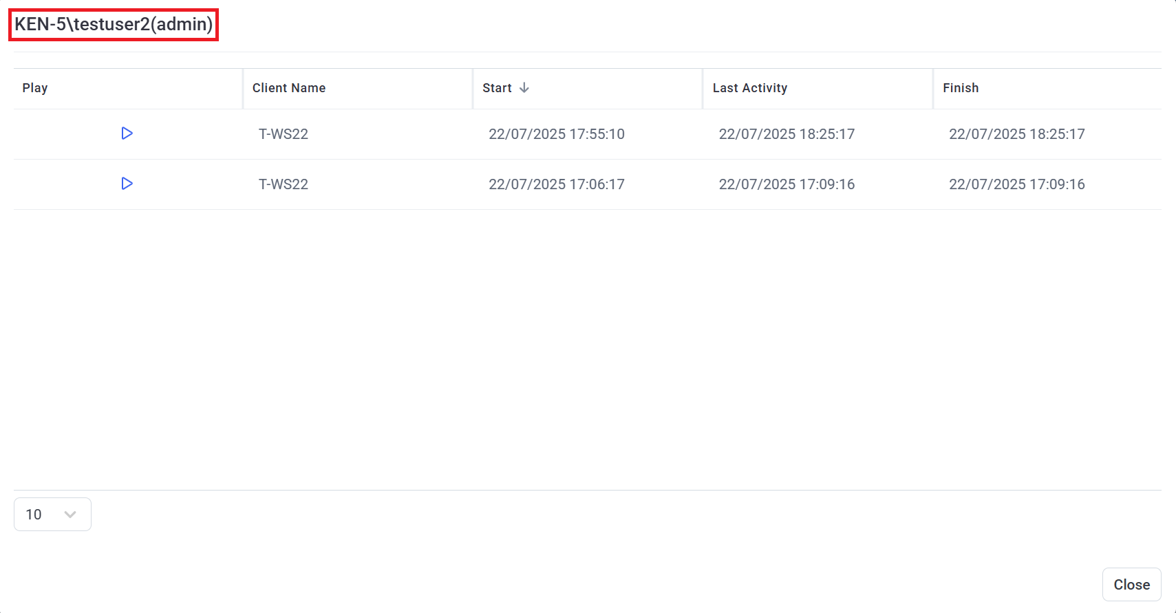
The following settings can be configured for this dashboard, by clicking the Filter Settings (
• Date Filter
• Users
• User Groups
• Sessions fewer than: The number of sessions that a user must have, so as not to be considered as having rarely logged in, and therefore be included in the list (i.e. displayed on the dashboard).
3.9. Rarely Used Computers: A grid showing information on the Client computers that have the fewest sessions within the specified date range (where the list can be sorted by clicking the column headers).
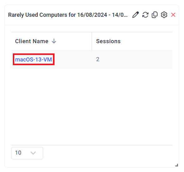
The grid contains the following columns:
• Client Name
• Sessions
To view detailed information on the sessions, click the required Client Name, and the following information is displayed in the pop-up window that opens:
• Play: Click the 
• User Name
• Start
• Last Activity
• Finish

The following settings can be configured for this dashboard, by clicking the Filter Settings (
• Date Filter
• Users
• User Groups
• Sessions fewer than: The number of sessions that a computer must have, so as not to be considered as rarely used, and therefore be included in the list (i.e. displayed on the dashboard).
4. Troubleshooting Issues
When dashboards are generated using large amounts of (or no) session data, no data may be displayed in the dashboards, in which case error messages such as the following are instead displayed:
• “There is too much data to process.” or “There is no data for the selected time range”.
• “The request timed out. Could not get the data for the "Rarely Used Computers for 02/27/2025 - 03/05/2025" dashboard".
To resolve these issues, try modifying:
1) The amount of data used to generate the dashboards (e.g. the range of the data selected in the filter settings).
2) The timeout value in the <add key="DashboardCommandTimeout" value="120000" /> key (where the default value is 120000) in the "EkranServer.Settings.config" file, which can be found in the C:\Program Files\Ekran System\Ekran System\Server folder on the computer where Syteca Application Server is installed.
